Someone Finally Built an Open-Source Datadog
Open-source observability · Databuff · AI chat for ops
If you work in ops, you know Datadog. It is a global cloud-observability giant—peak market cap around $90 billion.
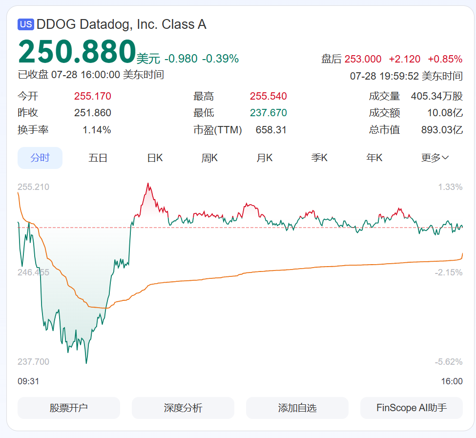
Traces, metrics, logs, service maps—the full suite.
It is also expensive and slow to ramp up; not every team can carry the budget and headcount.
So the circle kept asking: can there be an “open-source Datadog”?
Plainly: people want a self-hostable open-source version.
I recently scrolled past a GitHub project that feels close to that fantasy.
It is called Databuff.
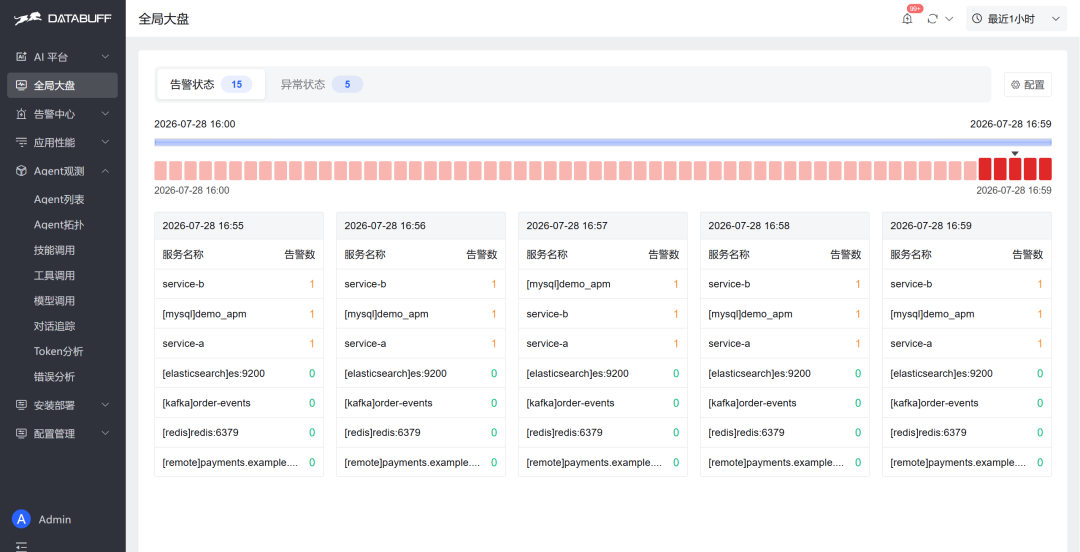
Today is a new-product unboxing—I’ll play with it live.
As a seasoned ops engineer, troubleshooting is muscle memory: find red nodes on topology, spikes on metric curves, keywords in logs.
Whether a new product saves a few steps shows up in one try.
Skip the concepts. Unbox first.
◆ ◆ ◆
1Open the box
Open the Demo and the first screen is not a wall of dashboards.
It is “How can I help you?”
The default entry is AI chat.
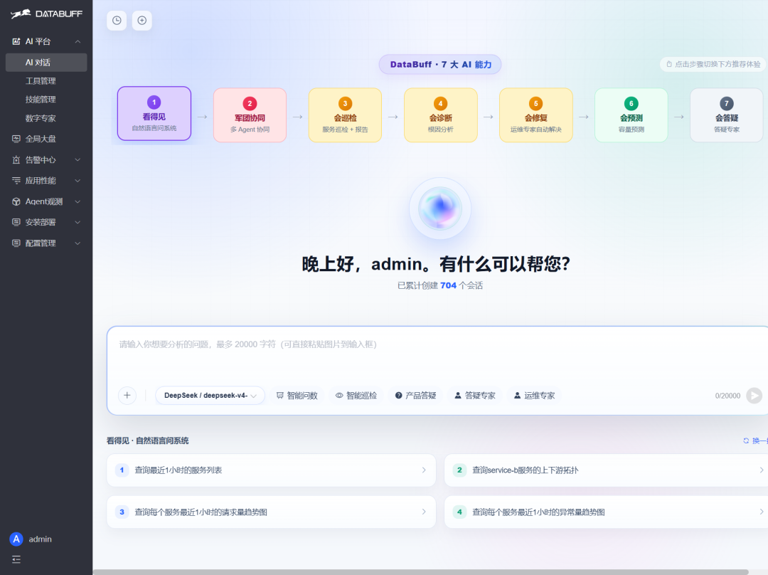
First look: AI chat is the default entry—not a dozen dashboards.
Capability chips sit on top—“see it, inspect it, diagnose it”—with prompt templates underneath.
I did not expect an open-source tool to open like this.
The left nav has what you need: dashboard, alerts, metrics, traces, logs, topology.
Unlike many open-source tools that throw dozens of Dashboards at you on day one.
Before: hunt the menu. Now: just ask.
◆ ◆ ◆
2The bigger surprise is the AI
Through the whole unboxing I never opened a user manual.
I wanted to explore on my own and see if I could make it work. Ask whatever comes to mind.
A few live scenes below—all asked on site.
01 · AI ask-data: plain language returns services, not small talk
First try: “List services in the last 1 hour.”
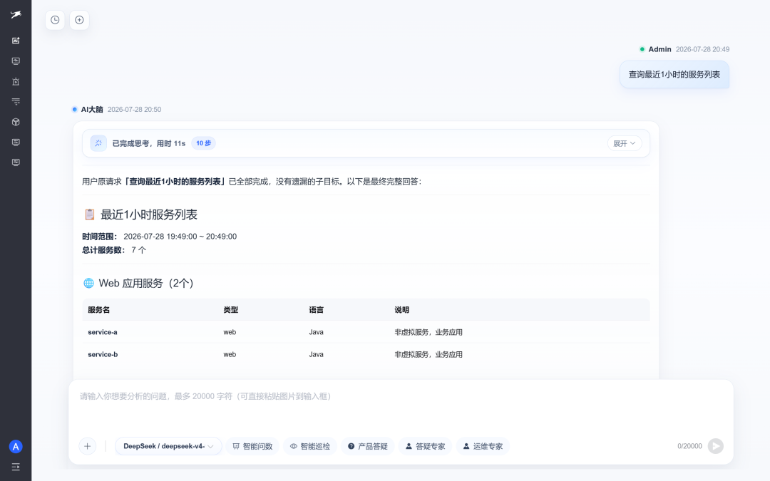
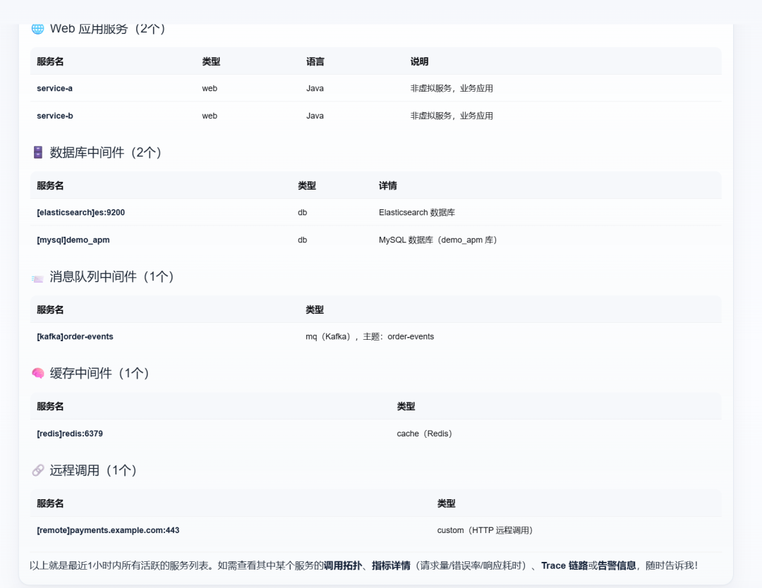
It answered directly—tabulated by category, with a time range.
On site: 7 services; service-a / service-b are Java Web, with MySQL, ES, Kafka, Redis, and a remote payment dependency underneath.
You can also see it hand the job to an “intelligent ask-data” expert and run a real query—transparent process.
On-call pain: checking inventory still means remembering metric names and flipping Dashboards. This skips that.
Real ask-data hits real telemetry—it does not just chat.
02 · AI incident diagnosis: root cause + remediation together
Next: “Run root-cause diagnosis on the service with the highest average latency and give remediations.”
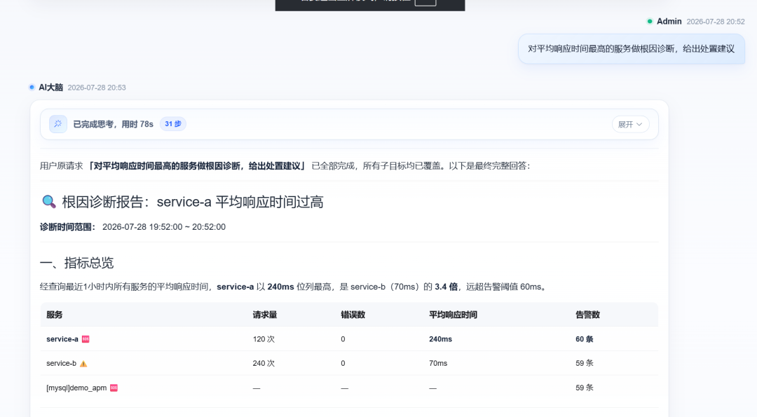
It first finds the highest average-latency service, then draws that service’s call topology.
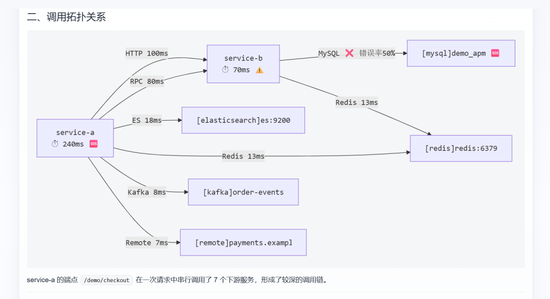
Then direct cause and deeper root cause.
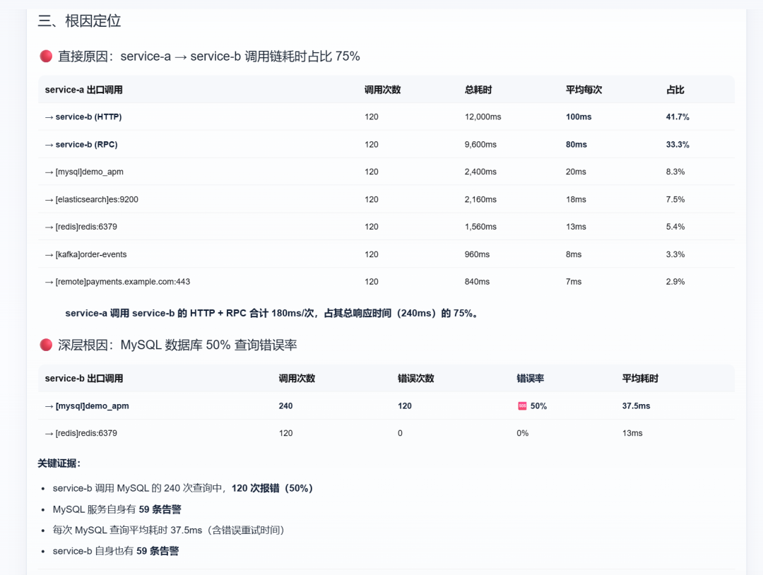
Plus fault-path reconstruction and remediations.
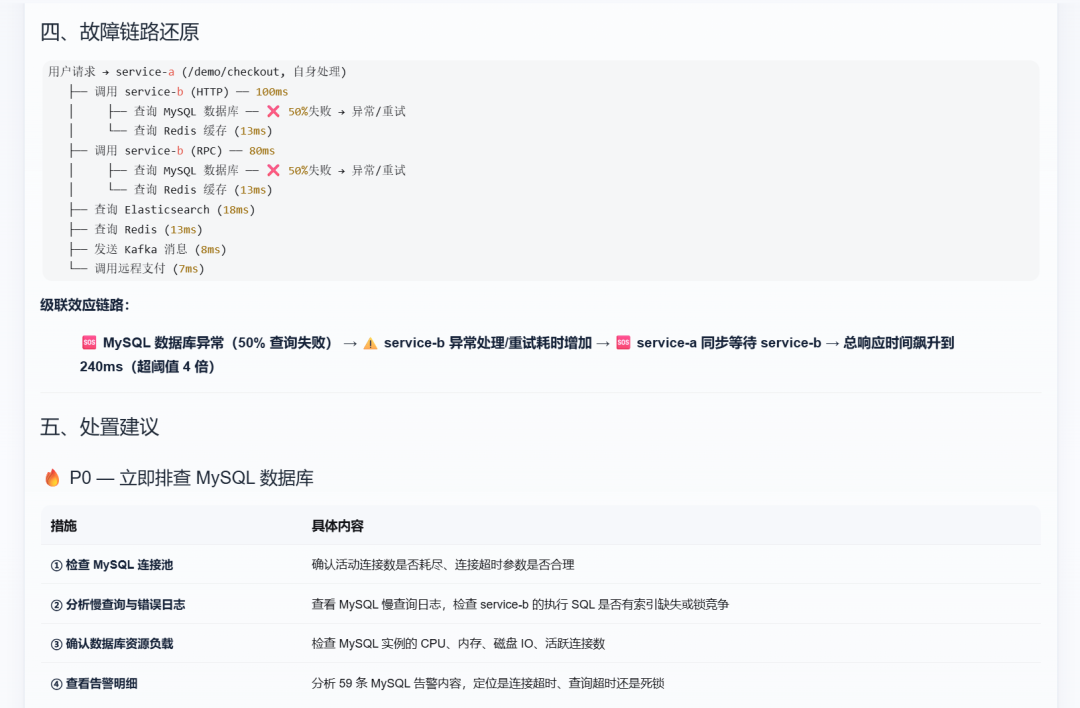
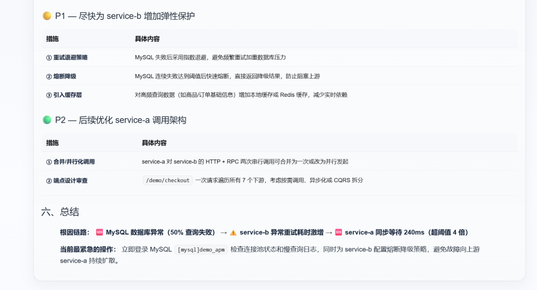
The overall flow:
Compare latency first: service-a ~240ms, over 3× service-b (~70ms), well above the alert threshold.
Break down calls: HTTP + RPC to service-b ate most of the delay; digging further, MySQL error rate was high.
Finally: urgent / short-term / mid-term advice—check connection pools, add circuit breakers, parallelize calls—down to actionable grain.
The surprise: not a pile of red dots for you to guess—but “where it’s slow, what to fix first” laid out.
That used to mean hopping topology ↔ metrics ↔ alerts. Now one sentence and the report assembles itself.
Unboxing dread is “talks a lot, does little”—here the substance density went up.
03 · AI reads traces / topology: blast radius and bottlenecks in plain words
Many tools draw topology; few read it in plain language.
On site I asked it to explain up/downstream: who is the front desk, who is the kitchen, which hop is slowest, who gets hurt.
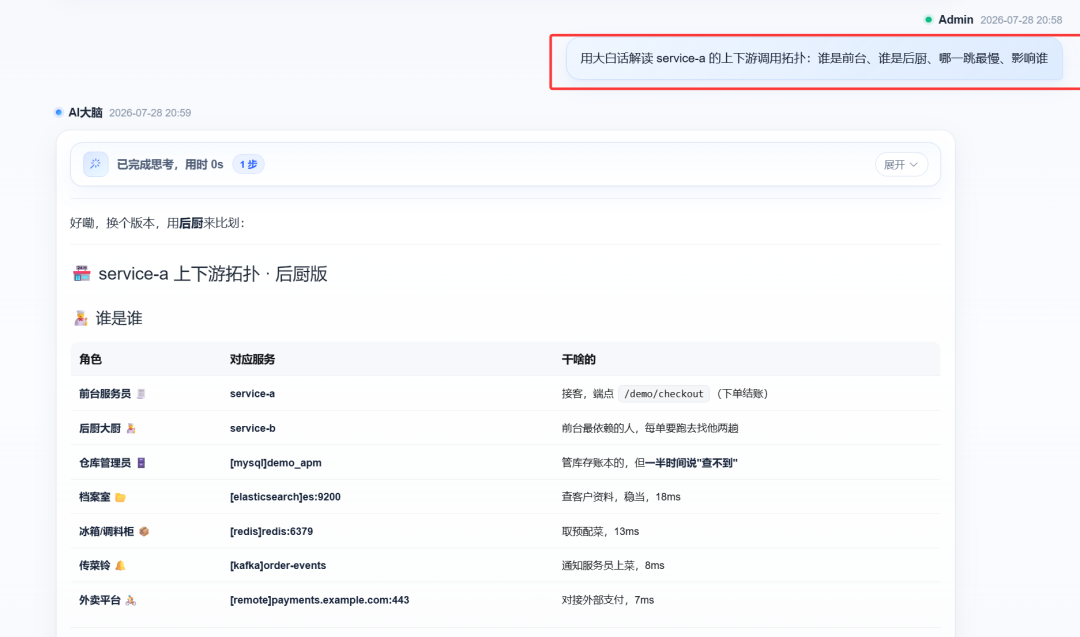
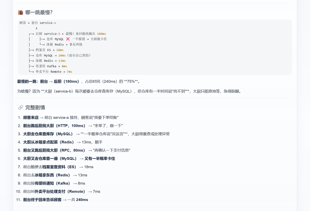
It actually used a kitchen metaphor to make the blast radius clear.
Front desk waits on kitchen; kitchen stuck on the warehouse; bottleneck eats most of total time.
The surprise is not a prettier graph—it is a conclusion you can tell a teammate.
No more pasting an unreadable topology screenshot into the on-call chat.
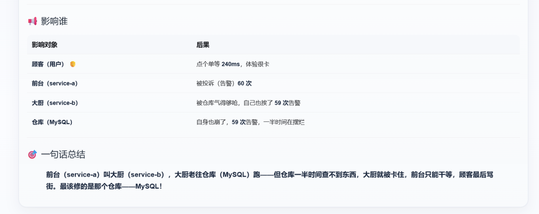
Bottleneck in one line: most time waiting downstream—fix the warehouse side first.
04 · Log analysis: pull the two lines that matter
Diagnosis pointed at inventory. I opened log analysis and searched stock / Insufficient.
WARN after WARN: Available stock below threshold (2 units)—inventory running low.
ERROR was clear too: InsufficientStockException, SKU matched, with a jump back to Trace.
The unboxing surprise lands here: logs are no longer a haystack—the “two lines of cause” line up with the trace.
Humans miss lines easily—upstream may still return 200 while the real WARN / ERROR sits downstream.
Ask-data opens the map, diagnosis gives the path, topology narrates impact, logs pin evidence—around real telemetry.
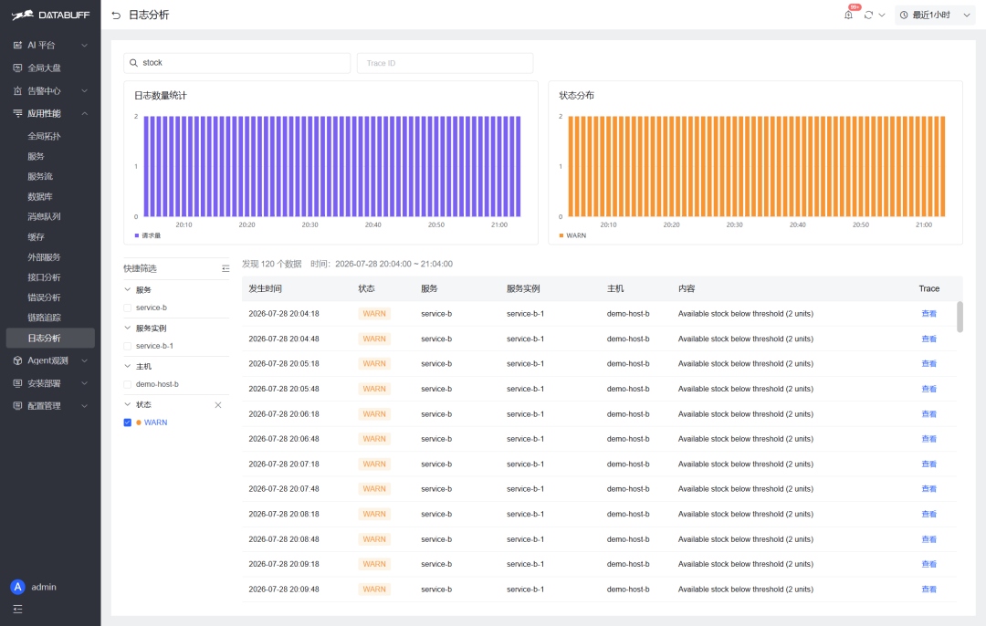
Log analysis · WARN: stock below threshold, with service/host, jump back to Trace.
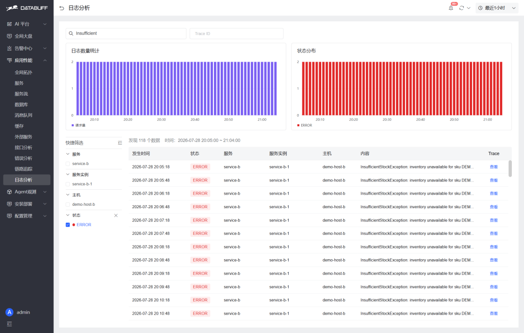
Log analysis · ERROR: InsufficientStockException in plain text, matches the diagnosis.
After a few moves it felt less like reading a product manual and more like unboxing a new toy: ask once, get surprised; when something doesn’t line up, peek at the panels.
For ops, fewer menu layers means a few fewer minutes of MTTR.
◆ ◆ ◆
3If you want to try it
The public Demo can reproduce the screenshots above without installing a full stack.
If you’re curious, open the Demo and click through these moves—ask, read the conclusion, then check the log panel. More solid than any comparison table.
You can demo the effect live; trying it yourself beats second-hand hype.
To stand up your own stack, the install script works:
Point apps or Collectors at the OTLP ingest for Trace / Metrics / Logs—usually still 4317 / 4318.
After install, don’t rush the feature tour. Get “ask → see conclusion” smooth first.
If that path works, depth can wait; if it doesn’t, more features are just a storefront.
◆ ◆ ◆
4Closing
Back to the title.
It is not that Datadog is unaffordable—it is that an “open-source Datadog” can be better value.
A self-hostable open-source observability tool.
Finally there is a place you can open a Demo, run an install script, and get surprised by AI out of the box.
If you want hands-on: open the public Demo and reproduce the moves above; if it feels right, run the install in a test environment.
Clicking through once beats any comparison table.
Less paper debate, more live reproduce.
◆ ◆ ◆